As usual, the entire code is located at the bottom. The next chapter is on testing our prototypes!
Installing the module
It's time to make our screens look prettier! When designing an app, it's always good to stick to the guidelines of the platform you're designing for so that the app matches the user's expectations and mental models. Today we'll have a look at Google's Material design guidelines, commonly seen in Android apps, and how to incorporate those into our prototype. Similar modules exist for other styles, such as iOS, as well, but we'll leave that for another time and focus on making our app look like a real Material app for now.
We start by downloading yet another module. This one is originally made by Steve Ruiz and so far I've really found it helpful. As usual I did make some changes again, to make it work properly with our FramerJS set-up and I made some tweaks to certain components (e.g., including the option to make e-mail and password input fields, which didn't seem to be possible before). You can download the module here. It comes with many files, but all we need is to:
- copy framer-md-app.framer/modules/md-components into your project's src/modules/md-components
- copy framer-md-app.framer/modules/md.coffee into your project's src/modules/md.coffee
- copy all files within framer-md-app.framer/modules/md-images into your project's public/modules (this folder probably doesn't exist yet)
- copy framer-md-app.framer/modules/md-fonts into your project's public/modules/md-fonts
Converting our current screens
After installing the new module, we can import it into our existing screens, like so:
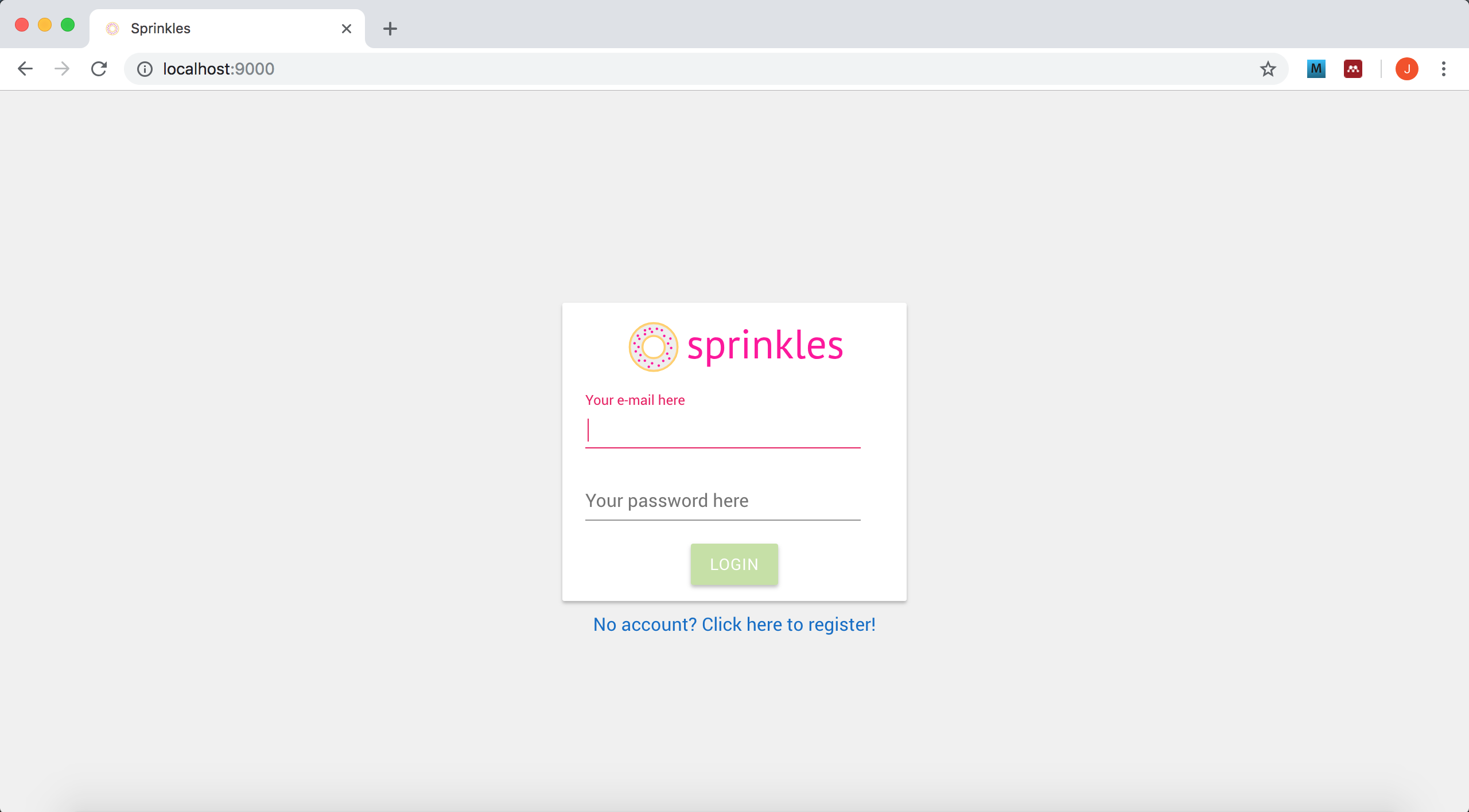
var md = require('./modules/md.coffee');We start with login.js. After adding the line above, we can start turning our screen into Material. First up is the container of all our input fields, let's turn that into what is called a "Card" in Material design:
// The (central) container displaying the required fields
var login_container = new md.Card({
  width: login_page.width * .8,
  height: 260,
  backgroundColor: "rgb(255, 255, 255)",
  parent: login_page
});
As you can see, not much has changed other than our move from Layer to md.Card. To make the card stand out a bit more from the background, I changed the screen's main background in the login_page layer:
// The page itself
var login_page = new Layer({
  width: pages.width,
  height: pages.height,
  backgroundColor: "rgb(240, 240, 240)",
  parent: pages.content
});
Moving on to the actual input fields, let's delete the two text fields we used to have, text_email and text_password, since the brand new input fields we're about to make already include instructions on what to put there as a built-in option, here called labelText. Switching the input fields is also a breeze, we actually only need to define a couple of properties on them, much less than before with our InputField:
// Field to enter e-mail address
var input_email = new md.TextField({
  x: 20,
  y: 77,
  width: login_container.width * .8,
  labelText: "Your e-mail here",
  type: "email",
  parent: login_container
});
Note how we're getting rid of all our font definitions, because Material takes care of those for us by defaulting to the Roboto font. We also make the input field a bit wider and move it to the left and change the vertical positioning, since the texts are gone. Now you might be wondering why I made you download the InputField module and have you build ugly screens, just to have you convert them and simplify them now. Let's say it's part of the learning process, and I wanted to introduce the more basic concepts of FramerJS such as Layers first, before moving on to the more specific (in this case Material design) implementations. The same trick for the password field:
// Field to enter password
var input_password = new md.TextField({
  x: 20,
  y: 140,
  width: login_container.width * .8,
  labelText: "Your password here",
  type: "password",
  parent: login_container
});
And our login button which changes to an md.Button object rather than a TextLayer:
// The login button
var button_login = new md.Button({
  x: Align.center,
  y: 210,
  text: "Login",
  parent: login_container
});
This button has lost most of its properties. Note that we do a center align to make it fit nicely in the middle of our container. Finally, the link to create an account should also lose its font properties so that it will become Roboto, and it changes to what is called an md.Regular object:
// Link to create a new account
var create_account_text = new md.Regular({
  y: login_container.y + login_container.height + 10,
  width: 300,
  color: "rgb(15, 108, 200)",
  text: "No account? Click here to register!",
  textAlign: "center",
  parent: login_page
});
md.Regular is a specific text object from the Material design module with certain properties (mainly the font size). There are a couple more, text-related objects with different sizes and weights (e.g., bold) in the module:
- Headline
- Subhead
- Title
- Regular
- Menu
- Body1
- Body2
- Caption
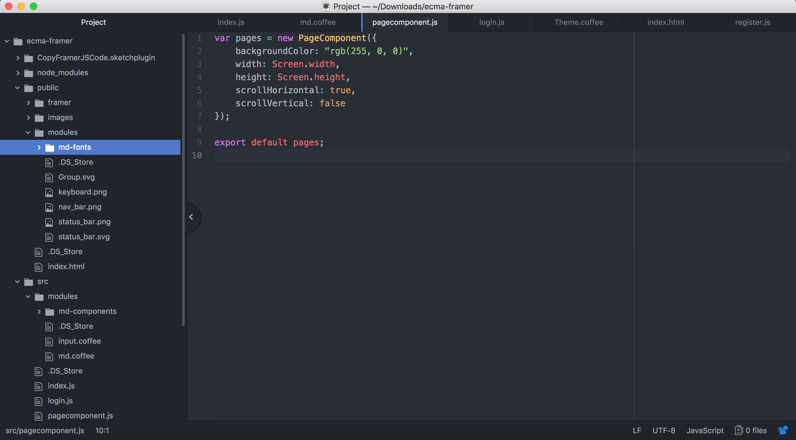
This should do it for our login page. It should now look something like this:
Nice, right? Let's give our registration page the same treatment. Starting by including the Material module into register.js:
var md = require('./modules/md.coffee');Here I also updated the main background:
// The page itself
var register_page = new Layer({
  width: pages.width,
  height: pages.height,
  backgroundColor: "rgb(240, 240, 240)",
  parent: pages.content
});
The container also gets a bit more space so that our (larger) input fields will fit:
// The (central) container displaying the required fields
var register_container = new md.Card({
  width: register_page.width * .8,
  height: 325,
  parent: register_page
});
As with the login screen, remember to delete all the instructional texts: text_name, text_email and text_password. Here are our new input fields, also made to be wider and positioned more towards the left since the text is now gone:
// Field to enter name
var input_name = new md.TextField({
  x: 20,
  y: 75,
  width: register_container.width * .8,
  labelText: "Your display name here",
  parent: register_container
});

// Field to enter e-mail address
var input_email = new md.TextField({
  x: 20,
  y: 140,
  width: register_container.width * .8,
  labelText: "Your e-mail here",
  type: "email",
  parent: register_container
});

// Field to enter password
var input_password = new md.TextField({
  x: 20,
  y: 205,
  width: register_container.width * .8,
  labelText: "Your password here",
  type: "password",
  parent: register_container
});
And finally our button:
// The button to create an account
var button_create_account = new md.Button({
  x: Align.center,
  y: 275,
  width: 200,
  text: "Create account",
  parent: register_container
});
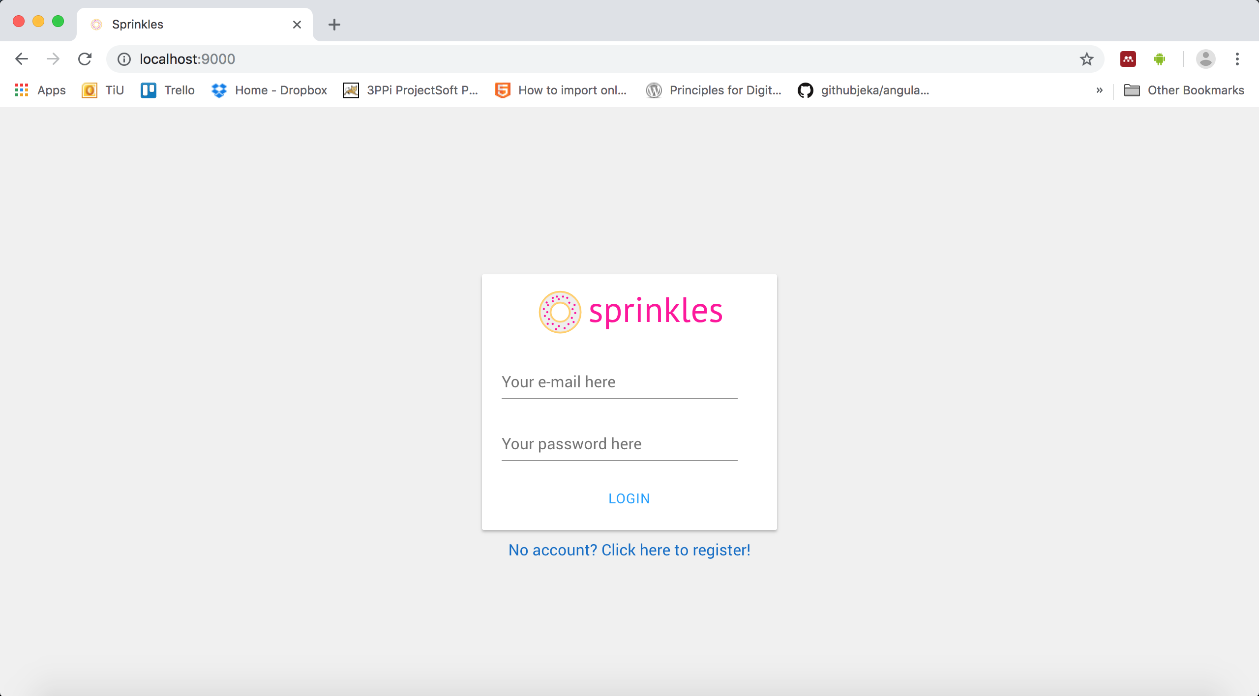
And there we have it:
Adding a chat screen
It's finally time to make a more complex and awesome screen: a chat window! First, a new file is needed, let's call it chat.js (such surprising names!). Again, we start with the basics of including some required files and modules, creating our main screen Layer and adding it to our PageComponent:
import pages from './pagecomponent.js';

var md = require('./modules/md.coffee');

// The page itself
var chat_page = new Layer({
  width: pages.width,
  height: pages.height,
  backgroundColor: "rgb(240, 240, 240)",
  parent: pages.content
});

pages.addPage(chat_page);
And we should offer this page for other pages to use, so we put the export command at the bottom:
export default chat_page;This should start to feel familiar. Let's also make sure that we can actually reach this page by adding a click event to our login button. For a quick moment, move to login.js and add the following code at the top to link to the newly created chat_page:
// At the top of login.js
import chat_page from './chat.js';
And then we add the event to transition to our chat screen after clicking on the "login" button:
// Add the click event to the "login" button
button_login.on(Events.Click, function(event, layer) {
    pages.snapToPage(chat_page);
});
Our login screen is now essentially quite useless since you can get past it without entering any valid information by pressing the login button, but we'll fix that later on. Okay, back to our chat.js. Here's something new: let's add the famous Material design header — that's the navigation bar you always see at the top of the screen:
// The bar at the top, containing a title and a button for navigation
var header = new md.Header({
  icon: 'arrow-left',
  title: 'Sprinkles',
  parent: chat_page
});
We provide it with a title, which will appear on top. For now I just put Sprinkles, the name of our app, so feel free to replace it with whichever name you came up with. When we actually have someone (or something!) to chat with, we'll probably replace this with the name of your conversational partner. Also note that we add an icon, this is what we'll see in the top left corner of the header, so you will generally see a menu icon there, but for now I added an arrow pointing left to indicate that we can go back to a previous screen. This is where you would normally go back to your list of contacts, for example. Adding a click event to this is done a bit differently from what we're used to, but more on that later.
Now we need a special container for our actual chat messages, as we'll need to be able to scroll through them without also scrolling our header away. FramerJS contains the aptly named ScrollComponent just for this purpose, look:
// This container provides scrolling functionality and will hold all the chat messages
var chat_container = new ScrollComponent({
  y: 80,
  height: chat_page.height - 50,
  width: chat_page.width,
  backgroundColor: "rgb(240, 240, 240)",
  scrollHorizontal: false,
  parent: chat_page
});
Sometimes it can get a bit confusing where certain objects are coming from, as we are freely mixing the basics of FramerJS with various modules. However, you can tell that this ScrollComponent is part of FramerJS and not the Material design module because there is no md. in front of the ScrollComponent. Note that we move it down a bit (80 pixels) so that it starts below the Header, and we also take a bit from its height in return. With these settings, you will see that it scrolls nicely. We also give it a bit of a gray background color, although for some reason this doesn't seem to apply until we actually put contents in there — at first it's a darker shade. It didn't bother me so far, but I might go in and have a look on how to change this later (like a true perfectionist). By default, the ScrollComponent supports scrolling in all directions, kind of like what you're used to from Google Maps. However, since we now only want vertical scrolling, we limit this by disabling scrollHorizontal. There's a lot of other stuff you can do with these ScrollComponents, as you can see here. Although the property of our PageComponent was also called scrollHorizontal, that one is actually more of a swiping functionality rather than the smooth scrolling we have with our ScrollComponent.
Finally, we should provide a way for the user to actually compose and send a message. To make it look like the way you're used to from apps like WhatsApp, let's start by creating a Layer with a background color that will contain our actual input field and send button:
// This layer at the bottom of the screen will host the input field and send button
var new_message_container = new Layer({
  y: Align.bottom,
  height: 70,
  width: chat_page.width,
  backgroundColor: md.Theme.colors.primary.main,
  parent: chat_page
});
In Material design (and in our module), usually a primary and secondary color are defined on which other shades are based. For example, our header takes the primary color while the bar above it (with the battery and time indicators) is a darker version of it. You might have also seen on our login and registration screens that the same blue color shows up for the underline and hint text when you select an input field. We can retrieve these colors and their different shades from the md.Theme object so that we can be consistent throughout our app. We'll get to how to change the color scheme later on in this chapter. Next, we create a white background Layer with nicely rounded corners that will look like it's our input field, while the actual input field will be transparent and put on top of this one, to make things look smooth and professional:
// A nice rounded background for our text
var new_message_background = new Layer({
  x: 10,
  y: 10,
  height: 50,
  width: chat_page.width - 80,
  backgroundColor: "rgb(255, 255, 255)",
  borderRadius: 3,
  parent: new_message_container
});
There's a new property here called borderRadius, which means that the corners of our Layer will be rounded off rather than square, with a radius of 3 pixels. Increase this number and you will get a more rounded corner. Fun fact: if the width and height of your Layer are the same (resulting in a square), with borderRadius set to 50% of the width/height you will end up with a circle-shaped Layer — might come in handy some time!
I think this is the first time we've had so many Layers on top of Layers... One more on top of this one, the actual input field, and we're done. Instead of the TextField we were using so far, we'll switch to the TextArea because it accepts more than one line of text:
// We remove all the indicators and borders from our TextArea since we have our own background layer
var new_message_text = new md.TextArea({
  tint: "rgba(0, 0, 0, 0)",
  width: chat_page.width - 120,
  parent: new_message_background
});
Another neat trick: we set the tint, that's the color the border would take after you tap on the input field and actually start adding text, to an rgba color, which is the same as providing rgb color with the additional fourth parameter indicating the alpha channel, which is the transparency of the color. By setting it to 0, we make the color fully transparent, resulting in an invisible border around the input field — exactly what we want right now since we provide our own containers and borders!
The last step before we start adding functionality to our screen is to add the button to actually send our message. We'll just blatantly steal WhatsApps design conventions by taking a paper airplane icon:
// The paper plane icon to send our message
var new_message_icon = new md.Icon({
x: Align.right(-25),
y: Align.center,
icon: "send",
color: "rgb(255, 255, 255)",
parent: new_message_container
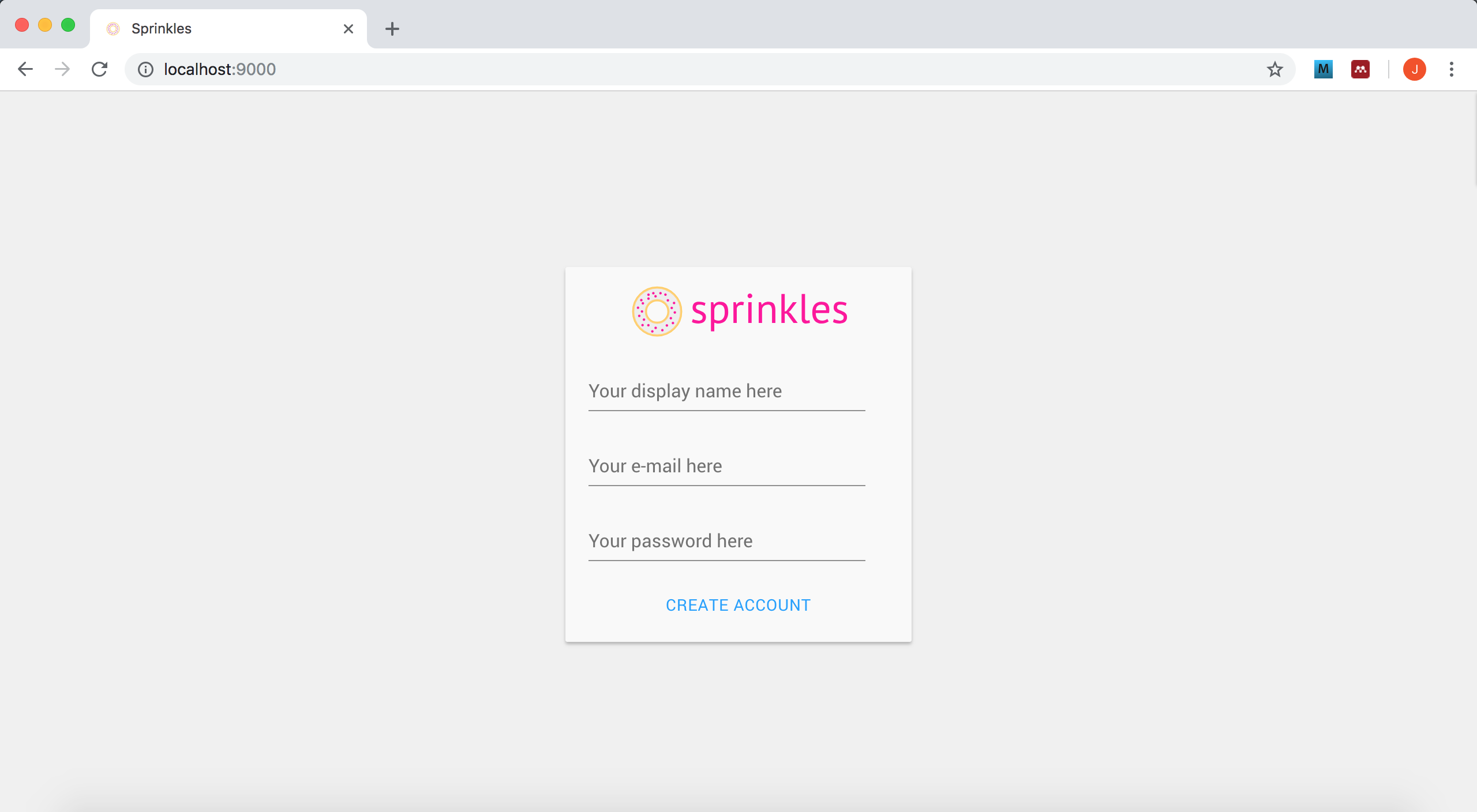
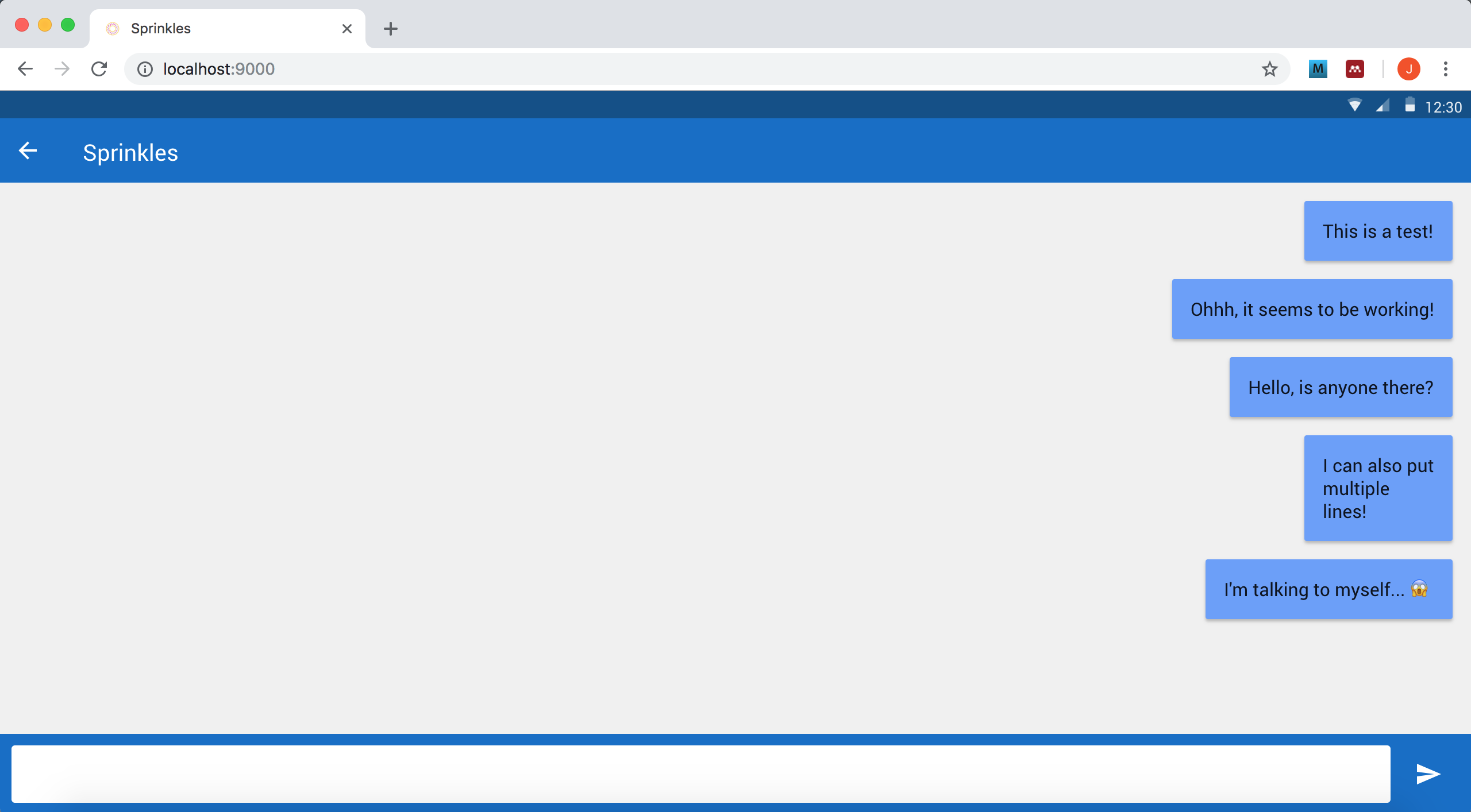
});What's cool about these icons is that they are vector images, meaning they scale infinitely without losing any of their crispness and detail. Just like our logo, by the way! I can highly recommend working with vector images when you are creating responsive designs, where you don't know what kind of super HD 4K magical screen people will be using. With these icons, note that we can also change their color (in this case, white), something that's hard to do with "normal" images. Alright, by now your screen should look something like this:
Adding some functionality
Of course we also want our messages to actually show up. To do that, we need a piece of code that generates the text balloon, fills it with the text we just wrote, and adds it to our ScrollComponent with all the right sizes and positioning. Just like in other chat programs, we'd like the color and position to be different depending on whether it is a message we sent, or it was a message that was sent to us by someone else. For example, messages we receive could show up on the left hand side with a default gray or white background, and messages we send are highlighted in green and shown on the right.
This should set off an alarm bell in your head, although don't be alarmed (hah!) if it didn't yet. Once you have some more programming experience under your belt, the type of situation where a certain activity that is almost the same every time (like creating a text balloon and adding it to our ScrollComponent) is repeated many times — in this case, whenever we send or receive a message — generally calls for a function that can easily be called upon many times, from different contexts (sending versus receiving). Defining a function is a lot like defining a variable:
// A basic, empty function structure
var my_function = function() {
  // Your function here
}
Anything you write in the "Your function here" area will not be triggered upon starting the app, only after the function has been called from somewhere by writing my_function();.
Because we want each chat message to show up below the other ones to indicate a timeline of messages, we need to tell the ScrollComponent at which y-coordinate to place the message. What this y-coordinate is will depend on where our last message was placed, and the size of this last message (more text = taller text balloon taking up more space!). Finally it's my chance to show you the real power of variables and how they remain available throughout the entire session with the app: we can store the desired y-coordinate for the future upcoming text balloon in a variable and update it whenever our function gets called. Start by defining the initial y-coordinate for the very first text balloon outside of our function, which will be set when the app is first started:
// This just goes anywhere in your chat.js file
var cur_y = 16;
I named it cur_y, meaning the current y-position we're supposed to put a text balloon at. Now we can start implementing our function to add new text balloons on the fly. Here's the basic function definition, without the actual code yet:
// Function to add a text balloon to the ScrollComponent
var add_text_balloon = function(text, is_mine) {
  // Our functionality will follow here
};
As you can see, I added two parameters to our function: text is straight-forward — it's the text that we want to display in our balloon. Throwback to our primitive data types: this will take on the form of a string type, or plain old text (yes, this does include emojis). Our second parameter is a boolean type, so we assume it to be either true or false, and it indicates whether it is a message that I (the user) sent, in which case the value of is_mine will be true, or whether it is a message that I received from someone else, where is_mine is false. Based on this parameter, we can customize the location and background color of our balloon. Let's start implementing the basic balloon functionality:
// Function to add a text balloon to the ScrollComponent
var add_text_balloon = function(text, is_mine) {
  var card = new md.Card({
    x: Align.left(16),
    y: cur_y,
    superLayer: chat_container.content
  });

  var txt = new md.Regular({
    text: text
  });

  if (txt.width > Screen.width / 2) {
    txt.width = Screen.width / 2;
  }

  var txt_width = txt._element.children[0].offsetWidth;
  var txt_height = txt._element.children[0].offsetHeight;

  card.width = txt_width + 32;
  card.height = txt_height + 8;
  card.addToStack(txt);

  if (is_mine) {
    card.backgroundColor = md.Theme.colors.secondary.light;
    card.x = Align.right(-16);
  }

  cur_y += txt_height + 48;
  chat_container.scrollToLayer(card);
};
Phew, a lot of stuff is happening here! I'll walk you through it:
- We create a new card, put it at our variable cur_y location, align it on the left of our screen and add it to our ScrollComponent chat_container;
- We put a text Layer on top of the card (md.Regular type) containing the text parameter we received in our function;
- If the width of the text Layer is larger than half of our screen, we limit it so that it doesn't take up more than half anymore. This automatically pushes any additional text to the next line, making the balloon taller. We want this to happen so that there is a clear separation between sent and received messages (right and left on the screen);
- We retrieve the actual width and height of our text (after resizing it if it went beyond half of the screen) — this is a bit complicated but it's the only way I found to reliably retrieve these;
- We use these properties of our text to resize our container, including some additional space around it, so that the Card covers the space we need to house the text;
- We add the text Layer to the Card using addToStack on the Card, providing the text as parameter;
- If it is a message we sent (if is_mine is set to true), we override some properties of the Card we previously set: the background color becomes a light version of the secondary color (in this case light blue), and we align it on the right side of the screen instead of the left side;
- We update cur_y so that we know where the next balloon after this one should start;
- If needed, we scroll the StackComponent to our newly created card. This is needed once messages start running off-screen, but we can always call the function as it simply won't do anything if no scrolling is possible.
I chose to go with the Material design Card object, the same as the container of our login and registration screens, because that automatically adds a nice shadow to the Layer, giving the illusion that our text is floating "on top of" our ScrollComponent.
An interesting detail is what will happen to our variable card: because we define it within the function add_text_balloon, contrary to our other variables so far it will not be remembered throughout our entire time of running the app. After the function finishes, so basically when we reach the closing curly bracket at the end, the variable is forgotten. But this is not a problem for us since it has served its purpose: we created a Card using it and added this Card to the ScrollComponent, after which we don't need to address this specific Card directly anymore. So while the contents of the variable card still remain, we cannot find them under card anymore. When the function is called again at a later point in time, we create a new variable card that holds a new text balloon. This is the opposite effect of what's happening with cur_y, because we had already defined the variable before, outside of the function add_text_balloon, and we are simply updating its value within the function. You can tell the difference by the fact that there is no keyword var in front of the cur_y, but it is there in front of the card variable. This is called the scope of the variable: the scope of card is only within the function, while the scope of cur_y is the entire application.
To test whether our function works, let's trigger this function whenever you have typed a message and pressed the "send" button:
// Add a click event to our "send" button to actually put the message on screen
new_message_icon.on(Events.Click, function() {
  // Create balloon
  add_text_balloon(new_message_text.value, true);

  // Empty our input field for the next message
  new_message_text.value = "";
});
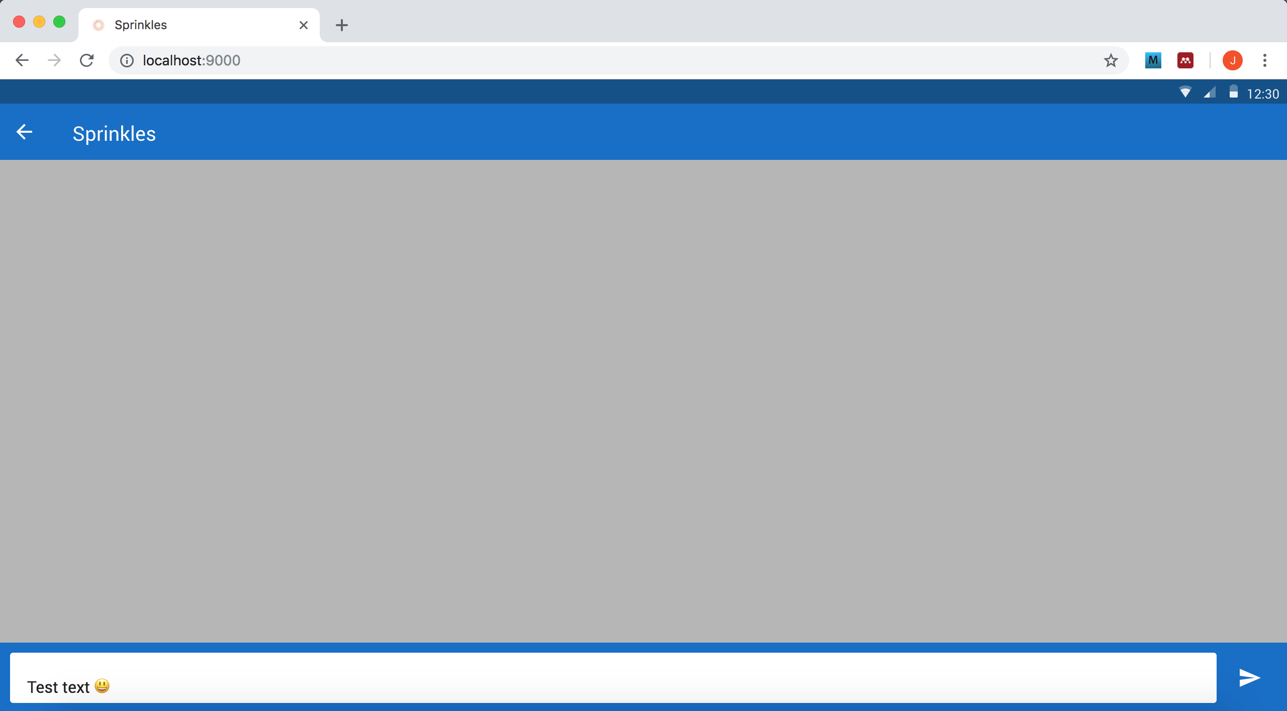
That's it! We call our newly created function, taking the current value of our text input field as the text parameter and we set our is_mine parameter to true since it's a message we created. We also clear out the input field afterwards so that it's ready to accept a new message. Since we don't have a conversational partner yet, it is only possible to have interesting monologues for now, which means that you will only see light blue text balloons appear on the right side, but we'll work on finding you someone to talk to soon!
Pro tip: if you're using a Mac, you can bring up the emoji keyboard with the cmd+ctrl+spacebar keys.
Playing with colors
The Material design guidelines also propose certain color schemes that can be used and combined to form the user interface of an app or website. They recommend to use only one primary and one secondary color, from which other shades are then derived. For example, you can see how the header and the bar containing the battery level and time are different shades of the same blue base color. There are a number of these color ranges from which you can pick, see: Material design tools for picking colors, specifically the 2014 Material Design color palettes. Of course you are not limited to what Material prescribes, but they are nice guidelines to keep in mind when picking a color scheme for your prototype.
For primary color, you would generally take the 500-level (more information here), and for a secondary color the 200-level. In our particular Material module, unfortunately the only way we can change our colors is by editing some files belonging to the module itself. This is not the cleanest solution, as ideally we want to use the modules as-is, but that's how it is currently designed. The good news is that we only need to make changes to one file, and only in one location. The file we're looking for is src/modules/md-components/Theme.coffee. Open that one and look for the following lines:
[...]

primaryColor = new Color('#0F6CC8')
primaryTextColor = new Color('#FFFFFF')

secondaryColor = new Color('#1B9DFF')
secondaryTextColor = new Color('#FFFFFF')

menuColor = new Color ('#CCCCCC')
menuTextColor = new Color('#000000')

pageColor = new Color('#FFFFFF')
pageTextColor = new Color('#333333')

[...]
We don't really use the menu and page from the module right now, but by changing the primaryColor and secondaryColor you will see things change throughout the app: the primaryColor is used for the chat screen and the selected input fields on our login and registration page, and the secondaryColor determines the color of the buttons. As a test, I changed mine to a bright pink and green:
[...]

primaryColor = new Color('#E91E63')
primaryTextColor = new Color('#FFFFFF')

secondaryColor = new Color('#C5E1A5')
secondaryTextColor = new Color('#FFFFFF')

menuColor = new Color ('#CCCCCC')
menuTextColor = new Color('#000000')

pageColor = new Color('#FFFFFF')
pageTextColor = new Color('#333333')

[...]
One last trick before we finish this big chapter: you can also turn these text-only buttons we now have — in Material design these are called flat buttons) into actual buttons with a background (raised buttons) by changing their type properties. Let's try it with the login screen:
// The login button
var button_login = new md.Button({
  x: Align.center,
  y: 210,
  text: "Login",
  type: "raised",
  parent: login_container
});
And with our new color scheme, it looks like this:
The next chapter will talk about testing our prototypes (also on mobile devices!).
login.js
var md = require('./modules/md.coffee');

import pages from './pagecomponent.js';
import register_page from './register.js';
import chat_page from './chat.js';

// The page itself
var login_page = new Layer({
  width: pages.width,
  height: pages.height,
  backgroundColor: "rgb(240, 240, 240)",
  parent: pages.content
});

// The (central) container displaying the required fields
var login_container = new md.Card({
  width: login_page.width * .8,
  height: 260,
  backgroundColor: "rgb(255, 255, 255)",
  parent: login_page
});

// If our screen is very wide, we limit the size of our container to 300px
if (login_container.width > 300) {
  login_container.width = 300;
}

// Center it, both horizontally and vertically
// Center after resizing, otherwise it uses the old width to calculate the center!
login_container.center();

// The amazing logo
var login_logo = new Layer({
  y: 0,
  width: 200,
  height: 80,
  image: "images/sprinkles.svg",
  parent: login_container
});

// Center this one, but only horizontally
login_logo.centerX();

// Field to enter e-mail address
var input_email = new md.TextField({
  x: 20,
  y: 77,
  width: login_container.width * .8,
  labelText: "Your e-mail here",
  type: "email",
  parent: login_container
});

// Field to enter password
var input_password = new md.TextField({
  x: 20,
  y: 140,
  width: login_container.width * .8,
  labelText: "Your password here",
  type: "password",
  parent: login_container
});

// The login button
var button_login = new md.Button({
  x: Align.center,
  y: 210,
  text: "Login",
  type: "raised",
  parent: login_container
});

// Add the click event to the "login" button
button_login.on(Events.Click, function(event, layer) {
  pages.snapToPage(chat_page);
});

// Link to create a new account
var create_account_text = new md.Regular({
  y: login_container.y + login_container.height + 10,
  width: 300,
  color: "rgb(15, 108, 200)",
  text: "No account? Click here to register!",
  textAlign: "center",
  parent: login_page
});

create_account_text.centerX();

// Add the click event to the "new account" link
create_account_text.on(Events.Click, function(event, layer) {
  pages.snapToPage(register_page);
});

export default login_page;
register.js
var md = require('./modules/md.coffee');

import pages from './pagecomponent.js';

// The page itself
var register_page = new Layer({
  width: pages.width,
  height: pages.height,
  backgroundColor: "rgb(240, 240, 240)",
  parent: pages.content
});

pages.addPage(register_page);

// The (central) container displaying the required fields
var register_container = new md.Card({
  width: register_page.width * .8,
  height: 325,
  parent: register_page
});

// If our screen is very wide, we limit the size of our container to 300px
if (register_container.width > 300) {
  register_container.width = 300;
}

register_container.center();

// The amazing logo
var register_logo = new Layer({
  y: 0,
  width: 200,
  height: 80,
  image: "images/sprinkles.svg",
  parent: register_container
});

// Center this one, but only horizontally
register_logo.centerX();

// Field to enter name
var input_name = new md.TextField({
  x: 20,
  y: 75,
  width: register_container.width * .8,
  labelText: "Your display name here",
  parent: register_container
});

// Field to enter e-mail address
var input_email = new md.TextField({
  x: 20,
  y: 140,
  width: register_container.width * .8,
  labelText: "Your e-mail here",
  type: "email",
  parent: register_container
});

// Field to enter password
var input_password = new md.TextField({
  x: 20,
  y: 205,
  width: register_container.width * .8,
  labelText: "Your password here",
  type: "password",
  parent: register_container
});

// The button to create an account
var button_create_account = new md.Button({
  x: Align.center,
  y: 275,
  width: 200,
  text: "Create account",
  parent: register_container
});

export default register_page;
chat.js
import pages from './pagecomponent.js';

var md = require('./modules/md.coffee');

// The page itself
var chat_page = new Layer({
  width: pages.width,
  height: pages.height,
  backgroundColor: "rgb(240, 240, 240)",
  parent: pages.content
});

pages.addPage(chat_page);

// The bar at the top, containing a title and a button for navigation
var header = new md.Header({
  icon: 'arrow-left',
  title: 'Sprinkles',
  parent: chat_page
});

// This container provides scrolling functionality and will hold all the chat messages
var chat_container = new ScrollComponent({
  y: 80,
  height: chat_page.height - 50,
  width: chat_page.width,
  backgroundColor: "rgb(240, 240, 240)",
  scrollHorizontal: false,
  parent: chat_page
});

// This layer at the bottom of the screen will host the input field and send button
var new_message_container = new Layer({
  y: Align.bottom,
  height: 70,
  width: chat_page.width,
  backgroundColor: md.Theme.colors.primary.main,
  parent: chat_page
});

// A nice rounded background for our text
var new_message_background = new Layer({
  x: 10,
  y: 10,
  height: 50,
  width: chat_page.width - 80,
  backgroundColor: "rgb(255, 255, 255)",
  borderRadius: 3,
  parent: new_message_container
});

// We remove all the indicators and borders from our TextArea since we have our own background layer
var new_message_text = new md.TextArea({
  tint: "rgba(0, 0, 0, 0)",
  width: chat_page.width - 120,
  parent: new_message_background
});

// The paper plane icon to send our message
var new_message_icon = new md.Icon({
  x: Align.right(-25),
  y: Align.center,
  icon: "send",
  color: "rgb(255, 255, 255)",
  parent: new_message_container
});

// Add a click event to our "send" button to actually put the message on screen
new_message_icon.on(Events.Click, function() {
  // Create balloon
  add_text_balloon(new_message_text.value, true);

  // Empty our input field for the next message
  new_message_text.value = "";
});

// Initialize the y-coordinate for our text balloons
var cur_y = 16;

// Function to add a text balloon to the ScrollComponent
var add_text_balloon = function(text, is_mine) {
  var card = new md.Card({
    x: Align.left(16),
    y: cur_y,
    superLayer: chat_container.content
  });

  var txt = new md.Regular({
    text: text
  });

  if (txt.width > Screen.width / 2) {
    txt.width = Screen.width / 2;
  }

  var txt_width = txt._element.children[0].offsetWidth;
  var txt_height = txt._element.children[0].offsetHeight;

  card.width = txt_width + 32;
  card.height = txt_height + 8;
  card.addToStack(txt);

  if (is_mine) {
    card.backgroundColor = md.Theme.colors.secondary.light;
    card.x = Align.right(-16);
  }

  cur_y += txt_height + 48;
  chat_container.scrollToLayer(card);
};

export default chat_page;